Page 1 of 3
Just Testing the water
Posted: Wed Jan 08, 2014 1:35 am
by Cheesegeezer
Ok so I thought i'd submit a collection I made for the missus (thought I better get that in).
I'm no whizz with photoshop by any means but here my "The Before Collection" efforts. Anyways here they are. I tried to keep it as authentic as possible.
LOGO
 BANNER
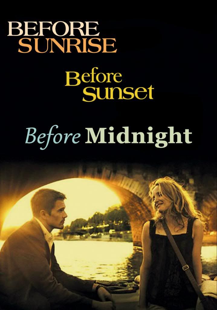
 POSTER
Re: Just Testing the water
Posted: Wed Jan 08, 2014 11:20 am
by ArieS
Hey Cheesegeezer,
The logo is great. You just need a couple of tweaks and it'll be approved. First thing, it's a bit too big. Follow this tutorial to properly size it:
http://forum.fanart.tv/viewtopic.php?f=18&t=42
Secondly, we need to add a shadow to it so it's visible on a white background. After playing around with it, the best looking result IMO is this:
- Add a shadow of 2px for Distance and 2px for Size. Duplicate your layer and on the top layer, modify the shadow to Distance 0 and Size 2. Finally change the opacity of the shadow to 50% on the top layer.
For the banner, I would try to work a bit on the left side. IMO it shouldn't be black but maybe brownish so it would blend better with the right side of it and doesn't look like 2 parts pasted side by side.
For the poster, I know this is an "older" movie so the sources are not great for it. However I think this one looks better. It's not pixelized, it's grainy which is fine. The lighting is much better too.
https://image.tmdb.org/t/p/original/mXM ... 718yKp.jpg
Always try to find the best source you can.
Of course this is just my opinion

Re: Just Testing the water
Posted: Wed Jan 08, 2014 1:45 pm
by Cheesegeezer
Thanks ArieS, really appreciate the feedback mate.
I thought i had followed all the guideline for the logo haha, oh well maybe not then, i'll revisit and implement your recommmendations, for all 3 images

Cheers
Re: Just Testing the water
Posted: Wed Jan 08, 2014 4:32 pm
by Tobby
Just like ArieS says the logo needs a shadow, the poster is too blurry and the banner as well. And even though there's no rule againt it the banner could really use some more creativity.
Re: Just Testing the water
Posted: Thu Jan 09, 2014 1:19 pm
by Paszt
Also, if you tighten up the tracking for the Classic Script font, the characters will connect. You can find the tracking setting in the Character window.
Re: Just Testing the water
Posted: Sun Feb 09, 2014 1:28 pm
by Cheesegeezer
Ok I wish to submit this set of Fanart for the TV show Arrow ID Number 257655
Firstly sorry for being quiet over the past few weeks, i've been so snowed under with work. Can someone explain/or point me to where a how do i submit? but more importantly can a moderator check this and see if it is upto Fanarts high standards (Thanks in Advance
)
BTW your forum is clipping the banners, (you'll have to copy image Url and paste in a new tab in a browser to see full size.

Cheers
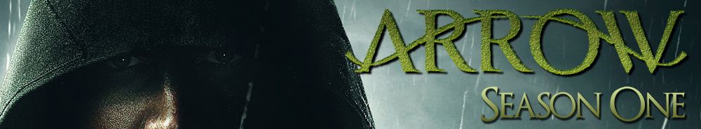
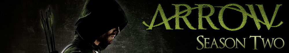
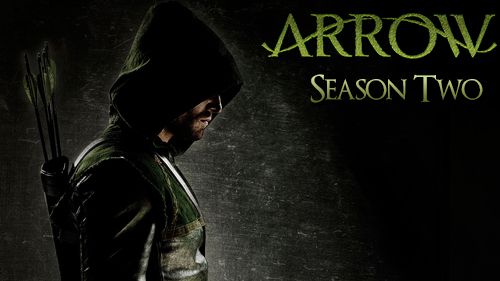
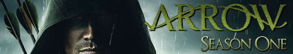
SEASON BANNERS
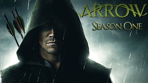
 SEASON THUMBS
Re: Just Testing the water
Posted: Mon Feb 10, 2014 1:00 am
by Tobby
To submit search for Arrow from the home page. The rest is pretty obvious.
Season banner 1: Nothing wrong with it, but it would probably look better if you showed more of his face.
Season banner 2: You need to adjust the color or find another soure.
Season thumb 1: Again, nothing wrong, butI would turn the shadow so it's the same way as in the banner.
Season thumb 2: There's a grey line the right-center that needs to go
Re: Just Testing the water
Posted: Mon Feb 10, 2014 6:13 am
by Cheesegeezer
Tobby wrote:To submit search for Arrow from the home page. The rest is pretty obvious.
Season banner 1: Nothing wrong with it, but it would probably look better if you showed more of his face.
Season banner 2: You need to adjust the color or find another soure.
Season thumb 1: Again, nothing wrong, butI would turn the shadow so it's the same way as in the banner.
Season thumb 2: There's a grey line the right-center that needs to go
Hey Tobby, thanks for your comments.
You have such a good eye for detail
i didnt even notice the shadow lol.
I kinda like the banner 1 as he is an elusive character in the show, but if you want more face, then i can do this.
I'll adjust the suggestions and repost/update.
Thanks for your time
Cheese
Re: Just Testing the water
Posted: Mon Feb 10, 2014 8:30 am
by Cheesegeezer
Revised Set based on your fixes @Tobby Please see artwork post for new images.
Except Season 1 Banner (more face)
Re: Just Testing the water
Posted: Mon Feb 10, 2014 9:41 am
by Kode
Cheezegeezer: I can't really comment from a moderation angle, but from an artistic viewpoint it's all subjective, I also like the first one, if there are no issues from a moderation point of view, upload whichever one you prefer.