I'm no whizz with photoshop by any means but here my "The Before Collection" efforts. Anyways here they are. I tried to keep it as authentic as possible.
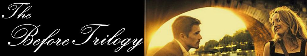
LOGO
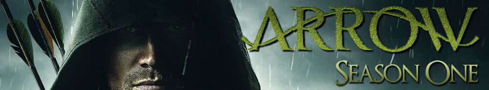
BANNER
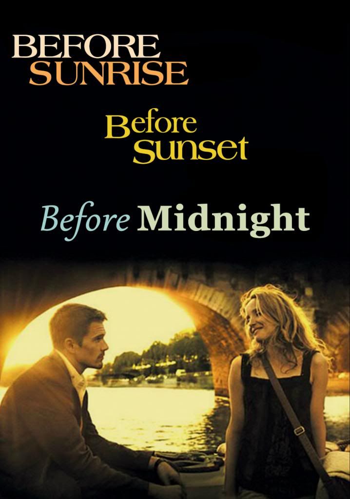
POSTER


Tobby wrote:To submit search for Arrow from the home page. The rest is pretty obvious.
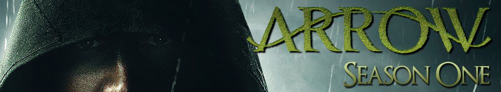
Season banner 1: Nothing wrong with it, but it would probably look better if you showed more of his face.
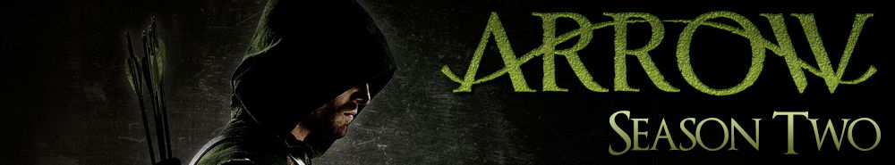
Season banner 2: You need to adjust the color or find another soure.
Season thumb 1: Again, nothing wrong, butI would turn the shadow so it's the same way as in the banner.
Season thumb 2: There's a grey line the right-center that needs to go


